Customize every detail#
Load data#
One of the greatest things of R data visualization is its community.
There are many open-source projects going on that revolve around getting
started and improving our data viz skills. One of my favorite projects
is tidytuesday, a
challenge consisting of sharing toy datasets, plotting them and posting
them together with the corresponding code on twitter with the hashtag
#tidytuesday.
They even share videos on
how to reproduce plots made by others just by looking at their final
plot! I think this is a great resource to get inspired, getting to know
new possibilities, and training. There are people that have made this a
weekly ritual! I recommend you to follow this twitter
bot to check out people’s ideas.
One of my favorite R plotters is
Cedric Scherer, who has become a
guru of data visualization. Check out his webpage!
Here, we will use the toy dataset from 2022/03/08 on EU student mobility, describing the movements of students throughout the ERASMUS program.
require(tidyverse)
require(ggpubr)

dat_url = "https://raw.githubusercontent.com/rfordatascience/tidytuesday/master/data/2022/2022-03-08/erasmus.csv"
dat = read_csv(dat_url)
dat %>% head(1) %>% t()

##                                     [,1]
## project_reference                   "2014-1-AT02-KA347-000139"
## academic_year                       "2014-2015"
## mobility_start_month                "2014-11"
## mobility_end_month                  "2014-11"
## mobility_duration                   "1"
## activity_mob                        "National youth meetings"
## field_of_education                  "? Unknown ?"
## participant_nationality             "AT"
## education_level                     "??? - ? Unknown ?"
## participant_gender                  "Female"
## participant_profile                 "Learner"
## special_needs                       "No"
## fewer_opportunities                 "Yes"
## group_leader                        "No"
## participant_age                     "13"
## sending_country_code                "AT"
## sending_city                        "Dornbirn"
## sending_organization                "bOJA - Bundesweites Netzwerk Offene Jugendarbeit"
## sending_organisation_erasmus_code   "-"
## receiving_country_code              "AT"
## receiving_city                      "Dornbirn"
## receiving_organization              "bOJA - Bundesweites Netzwerk Offene Jugendarbeit"
## receiving_organisation_erasmus_code "-"
## participants                        "2"
Explore the data using the functions introduced.#
Freestyle time! Try out the functions from ggpubr that we introduced
earlier to get some answers from this dataset (e.g. what is the most
common connection?).
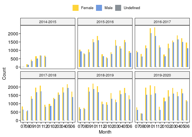
# mobility troughout years and months by gender
plt = dat %>%
    mutate(month=gsub(".*-","", mobility_start_month)) %>%
    count(academic_year, month, participant_gender) %>%
    ggbarplot(x="month", y="n", fill="participant_gender", palette="simpsons",
              facet.by="academic_year", position=position_dodge(0.5), color=NA) +
    labs(x="Month", y="Count", fill="")

plt
ggplot2 in depth: @KittJonathan’s version#
To exemplify how projects like tidytuesday can help us learning new
ways of plotting in R, I have copy-pasted
@KittJonathan’s version of the
challenge:
KittJonathan/tidytuesday.
In this github page you’ll find many more cool visualizations!
NOTE: you’ll need to install several extra packages to be able to run it:
showtext: edit fonts more easily in R graphs.countrycode: get country code names.
erasmus = dat

require(showtext)
require(countrycode)

# Load fonts ----

font_add_google(name = "Comfortaa", family = "Comfortaa")
showtext_auto()

# Data wrangling ----

country_codes <- codelist %>%
  select(iso2c, country_name = country.name.en)

d1 <- erasmus %>%
  filter(participant_nationality == "FR",  # keep data for french students
         receiving_country_code != "FR") %>%  # keep mobilities abroad
  select(receiving_country_code, participants) %>%   # remove unwanted columns
  left_join(country_codes, by = c("receiving_country_code" = "iso2c")) %>%  # add sending country name
  mutate(country_name = case_when(receiving_country_code == "EL" ~ "Greece",  # add missing country names
                                  receiving_country_code == "UK" ~ "United Kingdom",
                                  receiving_country_code == "CZ" ~ "Czech Republic",
                                  TRUE ~ country_name)) %>%
  group_by(country_name) %>%  # group data by country name
  mutate(total = sum(participants)) %>%   # count total number of participants for each receiving country
  filter(row_number() == 1) %>%  # keep 1 row by receiving country
  arrange(desc(total)) %>%   # arrange data by descending order
  ungroup() %>%  # ungroup data
  mutate(percent = 100 * total / sum(total)) %>%   # calculate ratio
  mutate(country_name = factor(country_name, levels = rev(country_name))) %>%  # set levels %>%
  head(10)  # keep top 10 destinations

# Create plot ----

p <- ggplot(data = d1,
       aes(x = country_name, y = total, fill = country_name)) +
  geom_bar(width = 0.9, stat = "identity", show.legend = FALSE) +
  scale_fill_manual(values = rep(c("#3caea3", "#173f5f"), 5)) +
  coord_polar(theta = "y", start = 0) +
  xlab("") +
  ylab("") +
  labs(caption = "Visualisation : Jonathan Kitt | Data source : Data.Europa | #TidyTuesday 2022 week 10") +
  geom_text(aes(x = country_name, y = 0, label = paste0(country_name, " - ", round(percent, digits = 1), " %")),
            hjust = 1.05, family = "Comfortaa", size = 10, colour = rep(c("#173f5f", "#3caea3"), 5)) +
  ggtitle(label = "Where do french students prefer to go ?",
          subtitle = "Top 10 destinations for french ERASMUS participants (2014-2020") +
  ylim(c(0, 250)) +
  theme_void() +
  theme(plot.background = element_rect(fill = "#d6ecef", colour = "#d6ecef"),
        panel.background = element_rect(fill = "#d6ecef", colour = "#d6ecef"),
        plot.title = element_text(family = "Comfortaa", size = 60, colour = "#173f5f", hjust = 0.5,
                                  margin = margin(t = 20)),
        plot.subtitle = element_text(family = "Comfortaa", size = 30, colour = "#173f5f", hjust = 0.5),
        plot.caption = element_text(colour = "#173f5f", size = 20, hjust = 0.5,
                                    margin = margin(b = 20)))

ggsave("images/2022_03_08_erasmus.png", p, dpi = 320, width = 12, height = 6)

References#
Session Info#
sessionInfo()

## R version 4.3.1 (2023-06-16)
## Platform: x86_64-pc-linux-gnu (64-bit)
## Running under: Ubuntu 18.04.6 LTS
##
## Matrix products: default
## BLAS:   /usr/lib/x86_64-linux-gnu/openblas/libblas.so.3
## LAPACK: /usr/lib/x86_64-linux-gnu/libopenblasp-r0.2.20.so;  LAPACK version 3.7.1
##
## locale:
##  [1] LC_CTYPE=en_US.UTF-8       LC_NUMERIC=C
##  [3] LC_TIME=es_ES.UTF-8        LC_COLLATE=en_US.UTF-8
##  [5] LC_MONETARY=es_ES.UTF-8    LC_MESSAGES=en_US.UTF-8
##  [7] LC_PAPER=es_ES.UTF-8       LC_NAME=C
##  [9] LC_ADDRESS=C               LC_TELEPHONE=C
## [11] LC_MEASUREMENT=es_ES.UTF-8 LC_IDENTIFICATION=C
##
## time zone: Europe/Madrid
## tzcode source: system (glibc)
##
## attached base packages:
## [1] stats     graphics  grDevices utils     datasets  methods   base
##
## other attached packages:
##  [1] countrycode_1.5.0 showtext_0.9-7    showtextdb_3.0    sysfonts_0.8.9
##  [5] ggpubr_0.4.0      lubridate_1.9.2   forcats_1.0.0     stringr_1.5.1
##  [9] dplyr_1.1.1       purrr_0.3.4       readr_2.1.5       tidyr_1.2.1
## [13] tibble_3.2.1      ggplot2_3.5.0     tidyverse_2.0.0
##
## loaded via a namespace (and not attached):
##  [1] gtable_0.3.4      xfun_0.42         rstatix_0.7.2     tzdb_0.3.0
##  [5] vctrs_0.6.1       tools_4.3.1       generics_0.1.3    curl_5.2.1
##  [9] parallel_4.3.1    fansi_1.0.3       highr_0.10        pkgconfig_2.0.3
## [13] lifecycle_1.0.4   compiler_4.3.1    farver_2.1.1      textshaping_0.3.7
## [17] munsell_0.5.0     ggsci_3.0.1       carData_3.0-5     htmltools_0.5.7
## [21] yaml_2.3.8        pillar_1.9.0      car_3.1-2         crayon_1.5.2
## [25] abind_1.4-5       tidyselect_1.2.1  digest_0.6.29     stringi_1.7.8
## [29] labeling_0.4.3    fastmap_1.1.1     grid_4.3.1        colorspace_2.0-3
## [33] cli_3.4.0         magrittr_2.0.3    utf8_1.2.4        broom_1.0.5
## [37] withr_3.0.0       scales_1.3.0      backports_1.4.1   bit64_4.0.5
## [41] timechange_0.3.0  rmarkdown_2.26    bit_4.0.5         ggsignif_0.6.4
## [45] ragg_1.3.0        hms_1.1.3         evaluate_0.23     knitr_1.45
## [49] rlang_1.1.0       glue_1.6.2        vroom_1.6.5       jsonlite_1.8.0
## [53] R6_2.5.1          systemfonts_1.0.6